Architect Duncan McLeod and set designer Lyndsay Milne McLeod on architecture for wellbeing in their playful west London home
Duncan McLeod: If you read books about architecture for wellbeing or happiness, one recurring theme is a sense of community. It’s important to me to create a sanctuary, but also to know what’s going on outside my walls. People say that on a street like this in London there’s no sense of community, but I think it comes down to how much effort you make. It gives me a sense of wellbeing to know the names of the local shopkeepers, for example; we say good morning to each other and make the time for a little chat.
Lyndsay Milne McLeod: I bought this flat in 1994. I was living with some friends from the Royal College of Art when I came for a nose around. I remember thinking “there’s a fireplace in the bathroom, I’ve got to have it”. Then I bought the shop below in 1997 and used it as a studio for set design. Duncan and I started really knocking things about in 2005.
Duncan: The project took about 10 years. Six years of that was DIY – there were long periods when Lyndsay and I spent every night and every weekend on it. We bought each other a steel beam one year… I think we bored a lot of our friends. It was a good project for me though, being a young architect at the time. I learnt everything about how to put a building together, right down to what type of screws you need.
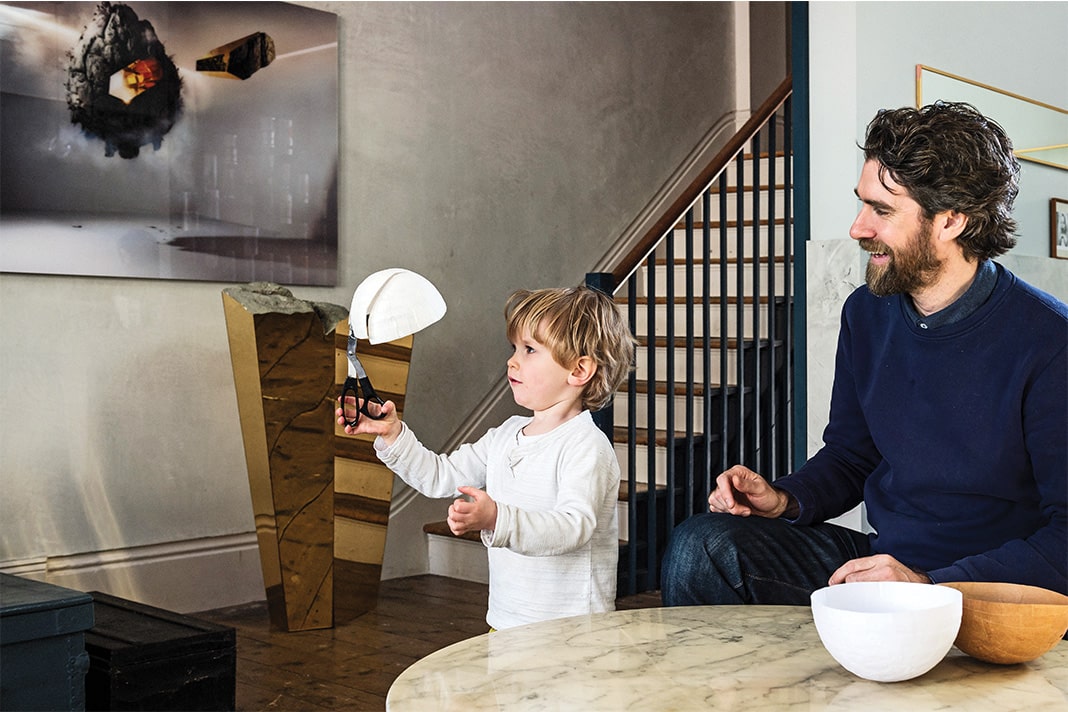
Lyndsay: I love the house’s sense of potential. Even now, there’s still more we want to do and we really enjoy that process – it’s part of who we are. When you live in a building that you’re doing up, you get a sense of every space and angle over time. The way we use the space has changed now that we have Oban, our three-year-old son, and it’s worked in our favour not to do it all in one quick rush.

Duncan: We extended into the old garden to build the studio. The brief was to have an office that didn’t feel like an office. We wanted something very crafted and soulful. The clerestory windows add a sense of height and drama but also mean that the light is controlled, which it wouldn’t be if we had skylights. The light that moves across the curved oak cladding is beautiful and changes during the day. We have a very human way of working with clients in which we try to define their notions of home, happiness and wellbeing before we design anything. It was the same here and we’ve designed the space to include things that are important to us: woodburning stoves, a projector for films in the living room and the outdoor spaces. The sliding staircase sums up our studio mantra that “there’s always a way”. I wanted to store my motorbike indoors. Lyndsay didn’t want to see it, so we came up with a solution that could work for both of us and this is the result. It slides to allow access to my motorbike when I need it, and hide it when I don’t. The whole team stood around thinking about what to clad it with. Someone suggested artificial grass and that was it. When we first installed it, Lyndsay hated it.
Lyndsay: Oban absolutely loves it. And it doesn’t look unnatural, so I think subliminally you still get a sense of nature inside the house. The garden is now raised to the first floor. Oban plays out there a lot. What was great was that even though we built over a backyard, it was disconnected from the flat before. So bringing it up meant that we got more outdoor space and it’s accessible from the flat. It’s win-win.

Duncan: The neighbouring commercial ground floor gardens are left to go to ruin. I would love for more people on the street to do what we did because if everyone had their gardens up here, you would get to see your neighbours more often and have a better sense of community.
Lyndsay: This place is really born out of our characters. We like a sense of history and narrative. It’s important to us to feel comfortable and rooted. So we laid the tiles in the hallway in a pattern that reflects the old floorplan of the shop and we planted a mimosa tree on the terrace, directly above one we had to remove for the build. I think it’s important to feel grounded in the history of a place; we didn’t just want to slap something completely new in.
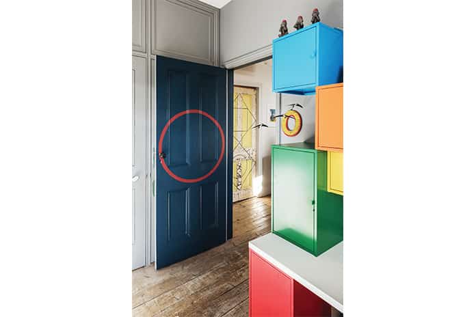
Duncan: Your house should reflect who you are. When we look back at the project we see a sense of playfulness, exploration and surprise. We’ve got plans to design a yellow monkey cage on the top terrace for a trampoline for Oban and to hang a garden shed on the side of the house where the bathroom is to satisfy my desire for a shed and a treehouse. It’s all a bit of fun, really even before we had Oban we wanted to design a house that children would absolutely love; I think that’s how a house should be.
Reproduced courtesy of The Modern House
For more home tours and interviews, visit The Modern House


Sam Curran
4 November
Love how you’ve blended creativity, history, and community to make a truly unique and welcoming home!