Extract taken from made.com
Photography by Veerle Evans
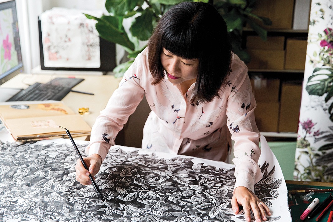
Statement walls – the clue’s in the name. The chance to be bold, on a small scale. Unlike the brash Changing Rooms approach of the nineties, feature walls today are refined. A chance to express your individuality, no matter how nuanced. You like flamingos? Bicycles? Botanicals? There’s a wallpaper for that. Pattern designer and interiors business-owner Sian Zeng shows us how she’s embraced the trend in her leafy London flat.
Fresh start
Sian’s always been into interiors, getting a wooden doll’s house as a child. “I used my pocket money to buy furniture pieces, excited to create this little styled home.” Moving into Kidbrooke Village in Greenwich with her husband Sebastian two years ago gave Sian another blank canvas. “The flat was brand new when we moved in. We just replaced the bedroom carpets with wood floors.”
Softly does it
“I’ve primarily used pastels, accented with brass and copper. Plus grey, as it complements so many other colours. The pink Frame armchair is incredibly comfortable and photographs beautifully against my plants – great for Instagram!”
Wall of glass
“The open plan living/dining room is my favourite area. I’ve tried not to fill the room with too much furniture, so that I can still have some empty space to move around in. Two of the walls are huge windows, making the room feel very light and spacious. It’s like having a bit of the outdoors, inside.”
Plants, please
Despite not having a garden, Sian’s still got green fingers. “All of the light and outdoor space allows me to grow a lot of plants, making our flat look a bit like a greenhouse.” She buys her plants in stages, online from places like Patch and IRL from a market by her studio.
Cloudy outlook
“The shades of pink work wonderfully against the green plants on one side and my Winter Snowdrift wallpaper on the other. The brass Austin floor lamp contrasts beautifully against the soft grey.”
Totally tropical
“When I use a bold statement wallpaper I keep the rest of the furniture fairly simple and pattern-free to allow the design to dominate. In the bedroom, we used my colourful Tropical Bloom Wallpaper, with simple grey furniture and curtains to complement it.”
Testing, testing
Before committing to a wallpaper purchase, Sian recommends getting a sample first. “Ideally, with a full pattern repeat, to test on the intended wall. It’s the best way to understand if a design will work in your space, under different light and with your decor.”
Serene space
“In my everyday life, I like to keep things tidy, but my working day is another story. When I’m designing, I allow my space to become messy while my mind is focused on creating. But when I’m done, I always return my desk space to a state of organised calm.”
Quiet zone
While Sian works from her London studio, having a home office space is important. “It’s where I go to brainstorm ideas, or if I need a quiet escape to gather my thoughts.” The Edelweiss desk drawers are filled with “everything from felt-tip pens and watercolours, to documents and concert tickets.”
That’s lush
“I love the large terrace surrounding our flat. I wanted to create a lush, secluded garden, so I planted crawlers to cover the glass [partition] wall. We got the Lyra garden lounge set in green, as the colour matched our terrace rails.”


COMMENTS ARE OFF THIS POST