Revamping your home in the new year? This new book by Emily Henson will inspire you to be bold with your interior choices
Extract from the chapter Playfully Bold from Be Bold by Emily Henson, published by Ryland Peters & Small
This Victorian terraced house on a quiet street in West London has recently seen some exciting changes. It is the first property that Rachel and Chris Roberts and their young family have been able to make truly their own, redesigning it top to bottom with the help of Office S&M, an architectural firm they commissioned to create a stylish, child-friendly home.
The busy professional couple – Rachel is a doctor and Chris a financial analyst – bought the house in 2013. Like many of us, their homes have always been decorated in dribs and drabs, never exactly the way they wanted. In 2016, they enlisted the help of London-based architects Office S&M to help create their dream home. At the time, the couple had three daughters and wanted to extend the loft to add another bedroom so that all the girls would have a room. They also planned to open up the kitchen to make it more suitable for family life. Now Rachel and Chris are parents to four girls: Vesper, aged six, four-year-old twins Taylor and Celeste, and newest addition Clara, six months old. When we visited, Rachel and Clara – a gorgeous, happy baby – were our hosts, but I am assured that when all the girls are home (and there isn’t a photo shoot taking place), noise levels are higher and toys are strewn everywhere.
I feel better knowing this because, as it is, the house is pretty perfect – a home that has been carefully considered and with no space wasted. Banquette seating was fitted in the kitchen, handy for stashing the aforementioned toys, while cupboards were built into the walls in the living room, filled with baskets that hold crayons, colouring books, train sets and princess dresses. With four young children, organization is key. A strong and varied colour palette was chosen for the interior, from dark teal to flamingo pink to cerulean blue. Woven through many of the rooms is a thread of vibrant pineapple yellow. An accent colour is such
an effective trick for tying together different colour palettes and it can be as simple as adding a cushion in the linking hue. In the entrance hall, the floors are laid with encaustic tiles from Bert & May, the only area to be treated to pattern. The stairs and walls are coated in various shades of teal, with that sunny yellow hue punching through on the banisters.
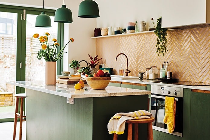
Towards the back of the house is the kitchen extension, from which I plan to steal many an idea for my own home. The colours here are punchy but not jarring. The crisp white walls are a backdrop for sage green cupboards, a deep plum banquette and pale pink herringbone tiles with bright yellow grout. Finished with pops of yellow throughout, the effect is incredibly satisfying.
Up the stairs, the teals and yellow continue until you reach the girls’ floor. One bedroom is painted a soothing pink, its rear wall punctuated by three arched windows. Next door in the bathroom, basic white square tiles are given added value with black grout, and yellow accessories are dotted throughout – doorknobs, a mirror, a stool, even the heated towel rack are all a sunny yellow shade. A smaller area of pink tile softens and warms the look.
This home shows that when you commit to a colour palette, it pays off. Simple ideas are elevated when linked by colour, and the luscious tones satisfy the eye. With simple materials used in fresh, modern ways, heaps of confident colour and a few luxurious splurges, the Roberts have built a happy home with room for their family to grow.
LIVING ROOM
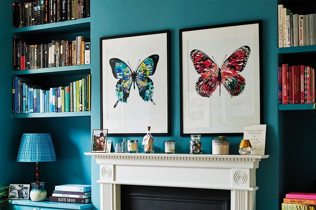
At the front of the house is the living room, pictured at the top of this page. Its walls cloaked in an intense and saturated blue from Farrow & Ball that also coats the cabinets and shelves that flank the fireplace. A black and white rug from the Plantation Rug Company, patterned silk cushions and a woven toy basket enliven the room further. The butterfly prints are from Rockett St George.
KITCHEN
Simple materials have an impact when treated in original ways. Pink tiles look fresh when laid
herringbone style and finished with yellow grout. The oak-fronted cabinets are painted in Farrow & Ball Green Smoke. The bamboo and plastic grain pendant lights are by Muuto.
KIDS ROOM
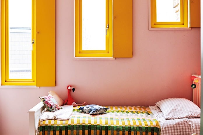
On the top floor, a bedroom was added for the growing family, with three arched windows painted in a sunny yellow shade. The shutters block out the light and add a sweet charm. The walls are painted in Farrow & Ball’s Calamine, a pink that is soothing rather than saccharine sweet.
BATHROOM
The girls’ bathroom is simple and efficient yet fun and playful. The basic white tiles are grouted with black, a wise choice since white grout stains quickly. The sink area is laid with smaller pink tiles, linking to the girls’ bedroom. A peppering of that joyful yellow, via the knobs, towels, mirror, towel rack and even the stool, completes the look.



COMMENTS ARE OFF THIS POST