Mama tours the stylish Fulham home of interior designer Lucinda Sanford
Interviewed by Pendle Harte
When did you move into your house and what was it like when you bought it?
We moved into the top half 5 years ago and then we started the basement dig and ground floor.
What did you do to change it?
We structurally changed this Victorian terrace to create more space and light into the home. The whole home has been entirely reworked. As an interior designer and master builder, I believe in fully integrating the design and build from start to finish. We dug to the basement that follows the footprint of the house and extended into the side return and converted the loft. We also rearranged the internal layout, in place of the usual two rooms on either side of the front door we enlarged the existing sitting room and turned what remained of the second reception room into an L-shaped entrance hall, installing a run of cupboards at the far end. I added two floor-to-ceiling glazed panels in the wall that separated the new sitting room from the entrance hall and positioned the staircase which would normally be opposite the front door around the corner of the L-shape and opposite the new glazed door that leads into the sitting room. All of this was done to avoid the dark tunnel effect typical of a Victorian terraced house.
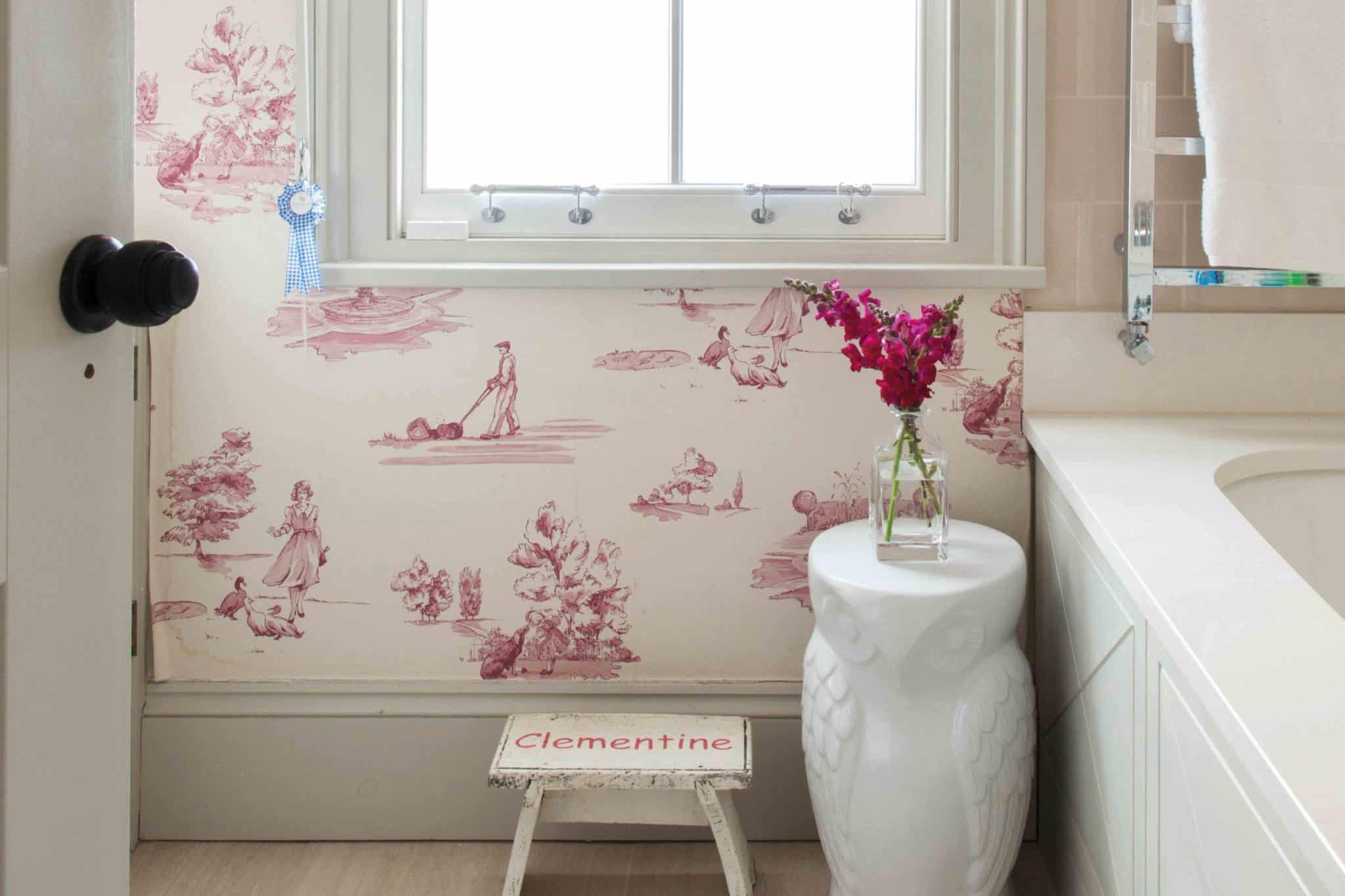
There are lots of pattern everywhere, and a striking wallpapered corridor. What are your thoughts on making patterns work?
I think the world has been stuck in the world of boring neutrals for far too long. I am all about colour and patterns – I believe heavy patterns are far better for hiding the effects of daily life and they are perfect for homes with children. I am a big believer that people should have more fun with patterns and layering them up. I love using patterns in a home, patterns and florals are a great way to create interest and charm, as well as to zone areas and make people smile.
We notice the internal glass doors – they are beautiful and a clever way of dividing spaces. Tell us your thoughts on them?
I don’t think open plan really works in life but I like spaces to connect and also that you can see from one room to another – little invitations in.
Your kitchen has been extended. What was it like originally? What did you change?
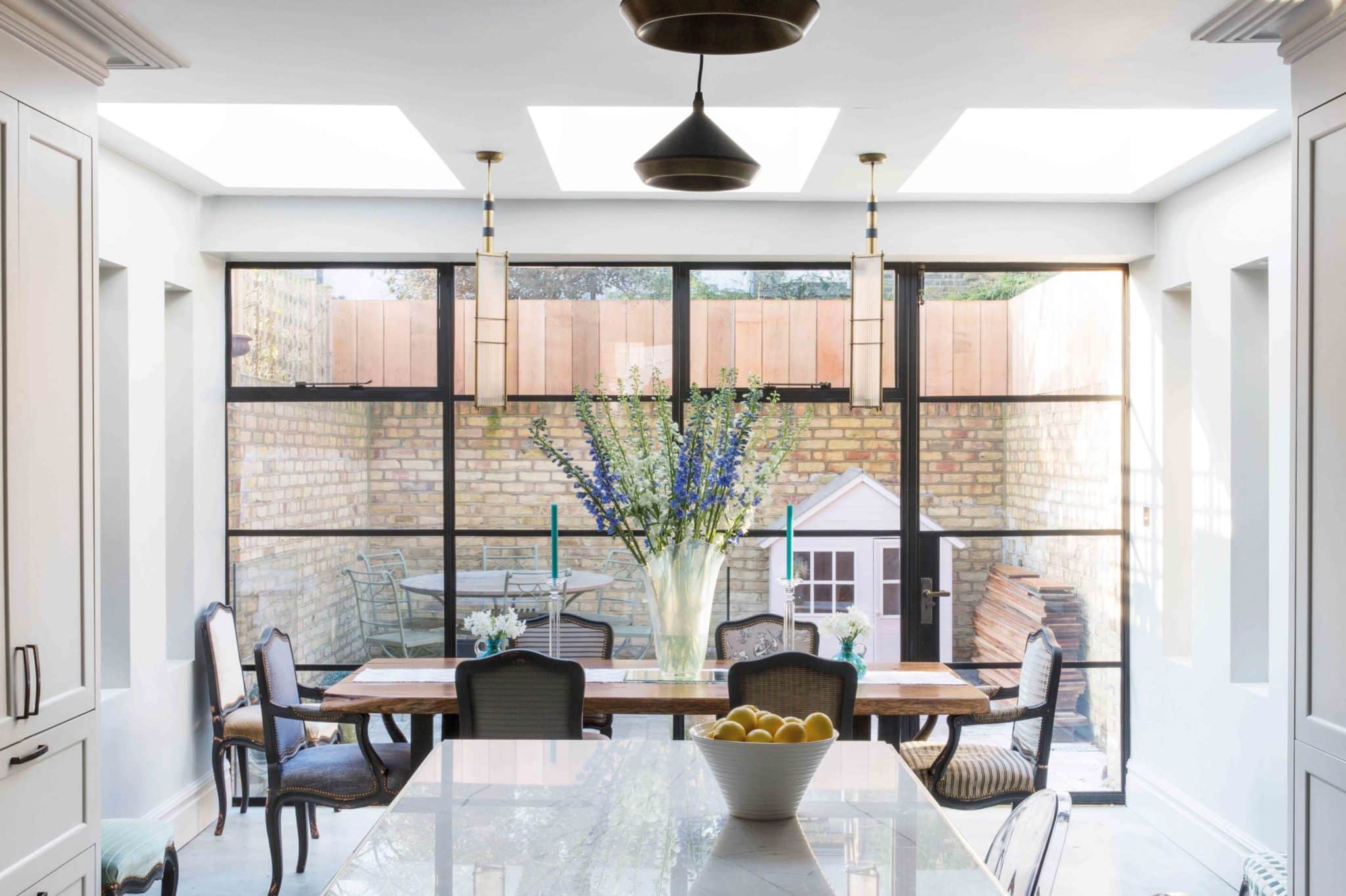
To create this bright family kitchen, we dug down to lower the floor and used glass panels and doors to embrace a new staircase and sitting room. We went for a traditional look in the kitchen and used antique mirrored tiles for splashbacks on both sides of the kitchen, a modern splashback would have been too clinical.
Is that gloss paint in your sitting room?
The paint is certainly gloss. I wanted to use a deep red for the sitting room but in gloss not matt, which is an unusual choice. I wanted to add additional visual interest. My husband and painter thought I was mad for choosing red gloss but in the end they were won over. The interesting part of the design was doing the matt cornice with a contract.
Your business is more than traditional interior design, involving builds and potentially planning applications. Can you explain how you work?
“Master Builder” is what describes Lucinda Sanford best – we take a house from concept to construction to completion. We are the masters of combining all the elements needed to make a property and turn it into a home. We can oversee the entire process – submit the planning, oversee the engineers and surveyors, and tie everything together. We have covered a range of London properties – I loved working on a new build apartment in Marylebone that was extremely modern in design.
Can you describe your signature style?
At the heart of my design is enthusiasm for a good layout. I am a complete layout addict, which is where the business’s architectural arm comes in. I love nothing more than working and reworking floor plans to make them suit each family. Even my own work still amazes me: despite the number of terraced houses I have worked on, they always end up with different layouts to suit their different owners. You may need to tweak your house, update it and edit it but when you design a house, its bone structure should stand the test of time. It’s easy for clients to get lost in their current moment and forget the future. Designing a home for babies won’t stand the test of time: children are children/teens and young adults for longer than they are babies. A key part of the work we do is the decoration, not the soft furnishing but the painting and architectural joinery.
Where do people go wrong with their interiors?
I always tell clients they don’t need to be ashamed and hide a radiator, a speaker or a television – we are all allowed to keep warm, listen to music and watch television.We always look at practicality and real life, a home should be a home and that means a real reflection of the people who live there and how they live in it. I often challenge my clients with their choices and I have a practical approach that they appreciate. I do not believe that homes should be over-styled. Also, I love colour. There is a place for neutrality, but colour and pattern are something that people are really missing out on. I just love the combination of different patterns and materials.
Check out Lucinda Sanford’s award winning building and design services.



COMMENTS ARE OFF THIS POST